
In the world of jewelry display, color is not only an expression of aesthetics, but also an invisible lever to stimulate consumer desire. Scientific data shows that appropriate color matching can increase jewelry sales by 23%-40%. This article will dismantle the triangular relationship between light, background color and jewelry material, and reveal the visual codes that top jewelry stores are reluctant to reveal.
1. How to combine jewelry display with lighting? ——Three rules of light and color linkage
Rule 1: Color temperature determines the character of jewelry
Cold white light (5000K-6000K): accurately restores the fire of diamonds and the velvety texture of sapphires, but makes gold look pale;
Warm yellow light (2700K-3000K): enhances the warmth of rose gold and the honey luster of amber, but may weaken the coldness of platinum;
Intelligent dimming system: high-end counters use adjustable color temperature LEDs, using 4000K neutral light during the day and switching to 2800K candlelight mode at night.
Rule 2: Angles create drama
45° side light: creates a flowing halo on the surface of the pearl, highlighting the layered pearlescent light;
Bottom light projection: makes the cotton wool structure inside the jadeite present a cloud effect, enhancing the sense of transparency;
Top light focusing: creates star reflections on the diamond pavilion, visually magnifying the carat number by 20%.
Rule 3: Light pollution defense
Install UV filters to prevent direct sunlight from fading organic gemstones (corals, pearls);
Use matte sunshades to eliminate reflective interference from glass counters.
2. What colors make people want to buy jewelry? ——The color attack of consumer Psychological warfare
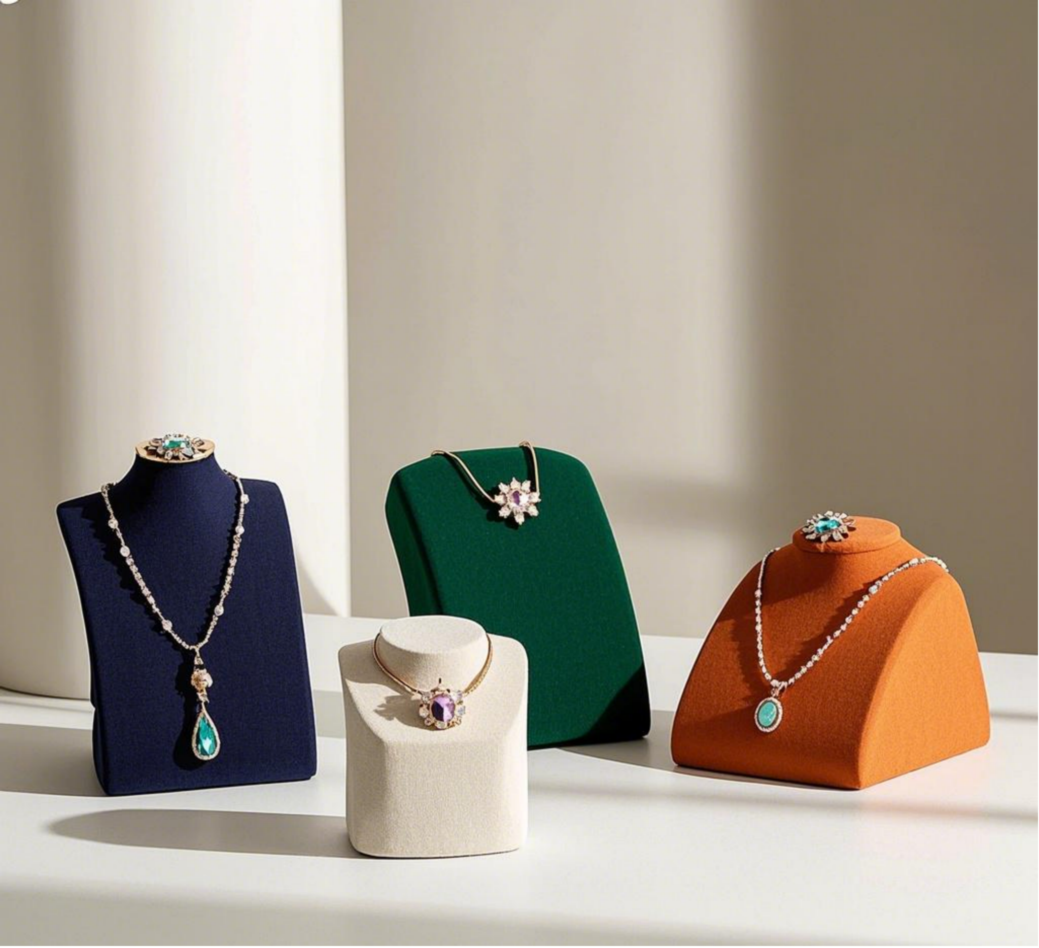
① Imperial gold and midnight blue
Champagne gold displays with dark blue velvet activate the brain reward circuit and stimulate the transaction rate of high-end jewelry;
Experiments have shown that this combination extends the customer’s stay time by 37%.
② Burgundy red trap
Wine red background can induce dopamine secretion, which is particularly suitable for Valentine’s Day theme display;
But the area ratio must be strictly controlled (no more than 30% is recommended) to avoid visual oppression.
③ Black and white game theory
The diamond ring on the black acrylic display board is 1.5 times larger than the same model on the white background;
The white ceramic tray can increase the saturation of colored gemstones by 28%.
Neuroscience Easter egg: The human eye recognizes Tiffany blue 0.3 seconds faster than ordinary blue. This is the underlying
logic of luxury brands monopolizing specific Pantone colors.
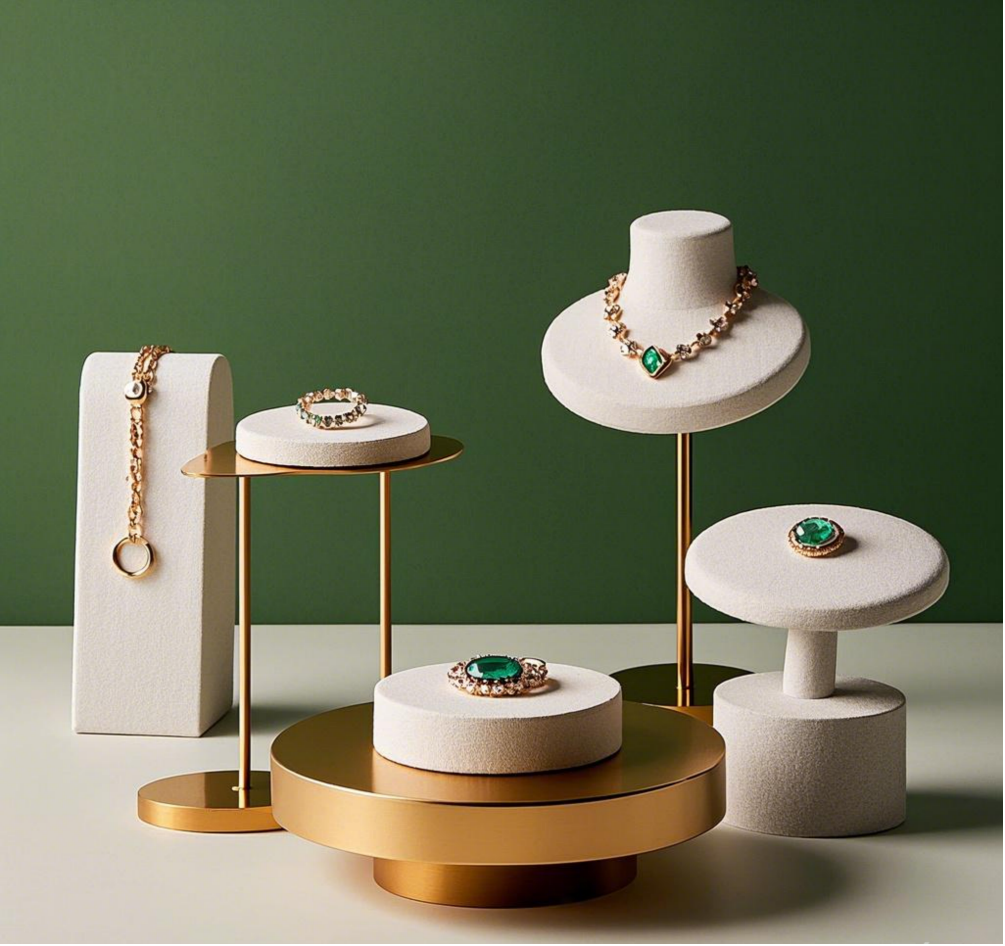
3. How to display retail jewelry? ——Five-dimensional display method to double sales
Dimension 1: Material dialogue game
Wooden display racks with silver jewelry create a Nordic minimalist style;
Mirrored stainless steel holds colored gems to create a sense of future technology.
Dimension 2: High Psychology
Gold necklaces are placed 15° below the horizon (triggering the desire to get close);
Wedding ring series are displayed at a height of 155cm (matching the natural hand-raising angle when trying on).
Dimension 3: Dynamic white space
Retain 40% negative space per square meter of exhibition area, separated by green plants or art installations;
The speed of the rotating booth is controlled at 2 rpm to create a “glance” effect.
Dimension 4: Storytelling scene
Antique brooches are embedded in old photo frames, and the original owner’s manuscript replica is printed on the back;
Use miniature architectural models to display jewelry, such as the Eiffel Tower model hung with Parisian necklaces.
Dimension 5: Data-driven iteration
Use heat maps to analyze the areas where customers’ eyes stay and adjust the positions of key products every quarter;
Brighten the lights by 15% on Friday nights to match the “tipsy shopping” mentality of urban people.
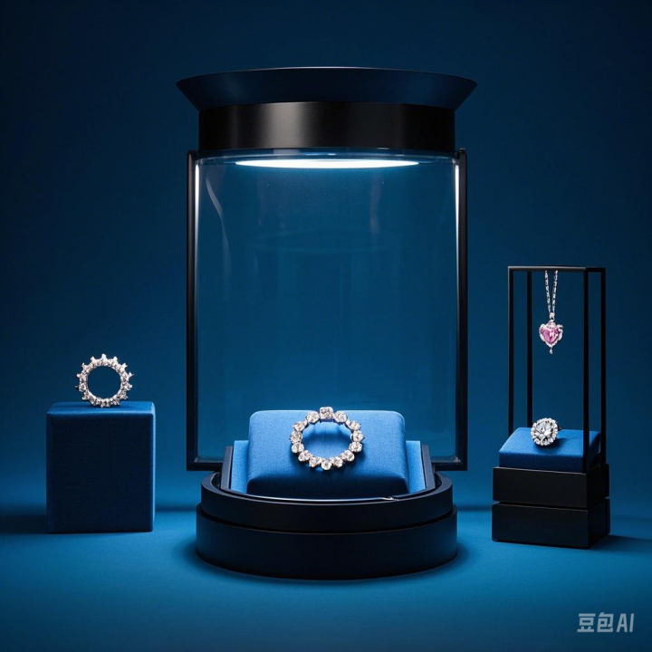
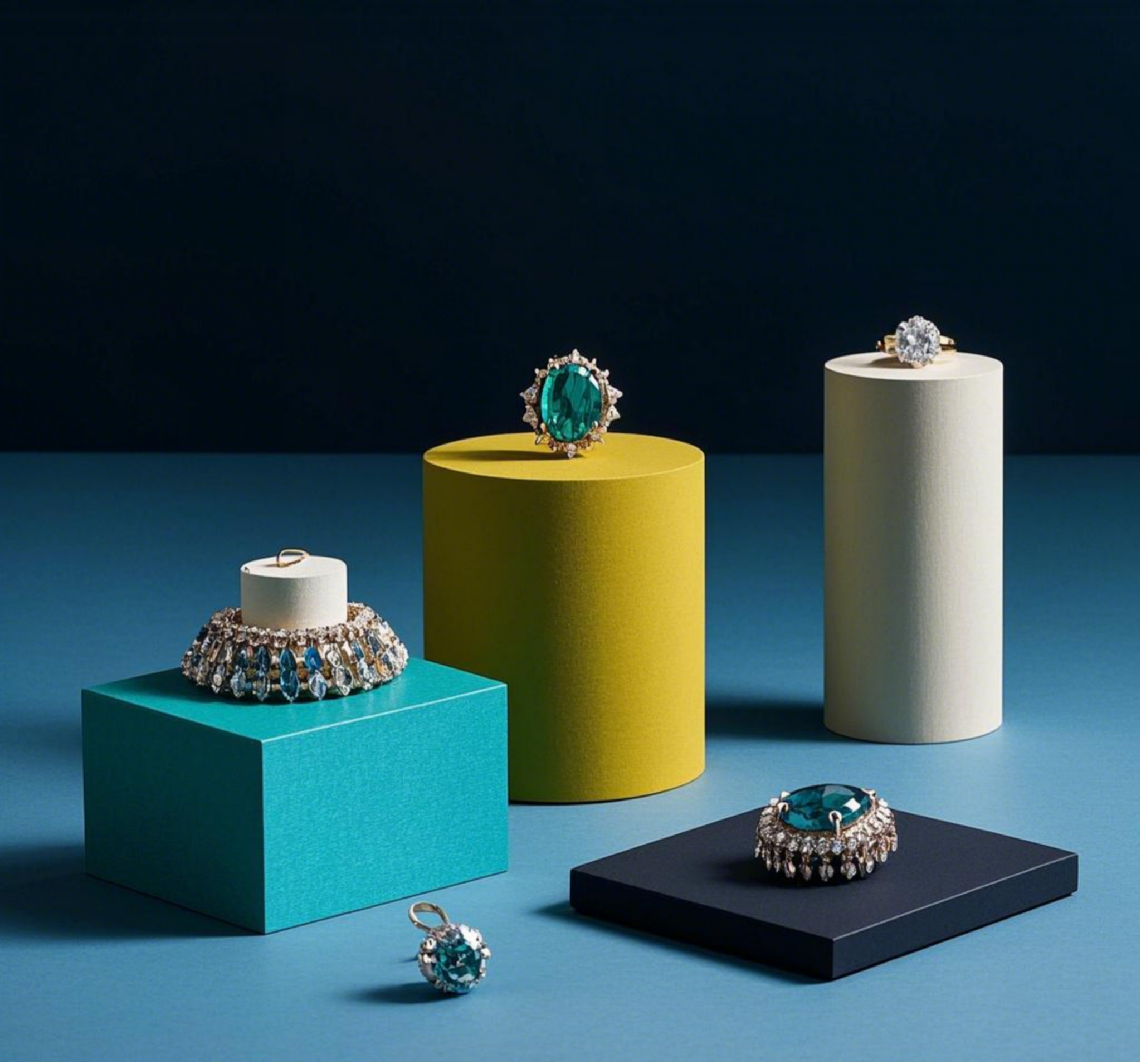
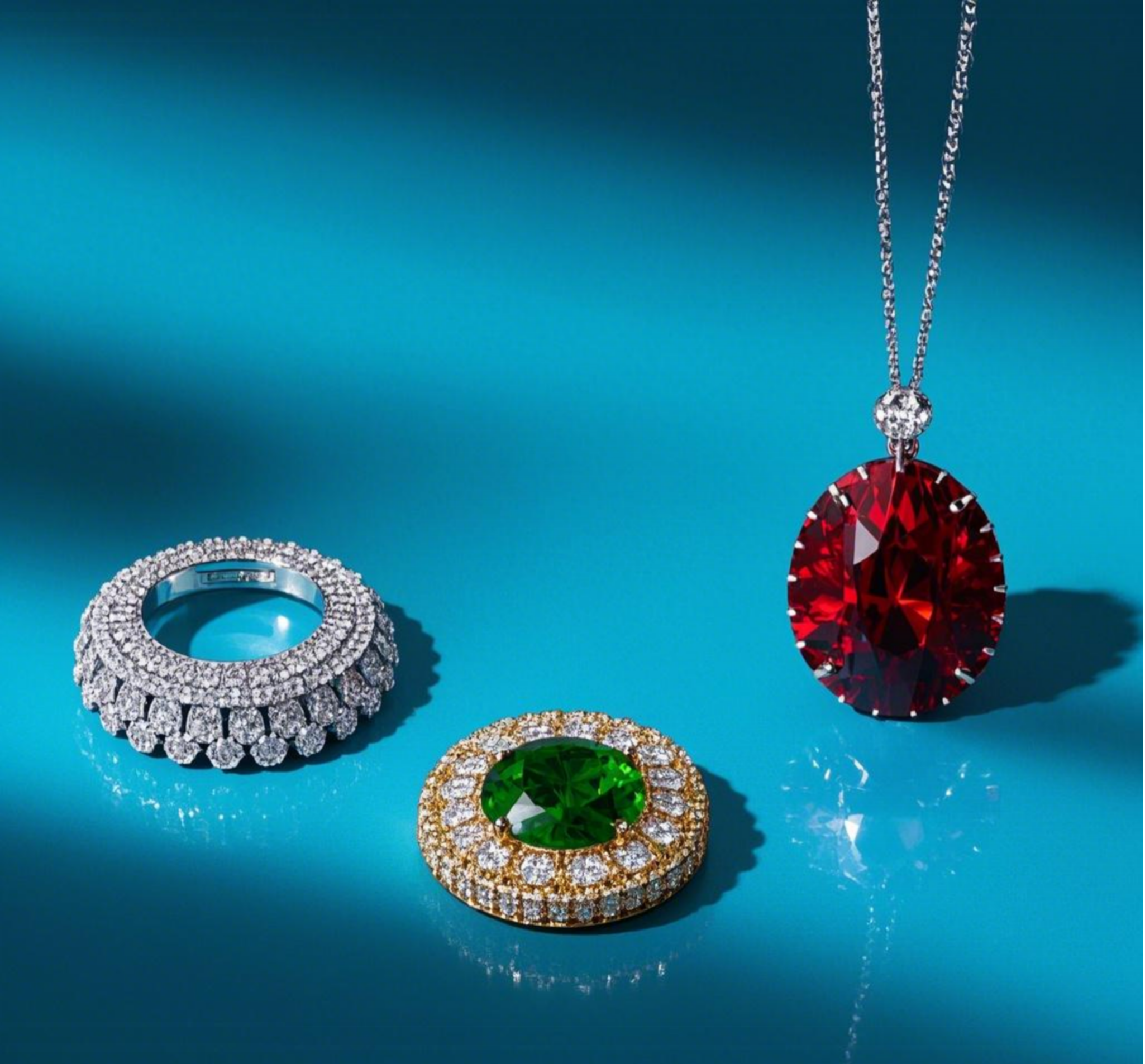
4. What is the best background color for jewelry? ——Quantum entanglement of materials and colors
Diamond:
Best partner: Black Hole Lab (Black 3.0 paint absorbs 99.96% of light);
Taboo: Do not use light gray, which will cause the fire to disperse.
Gold:
Dark navy blue velvet background, gold color purity increased by 19%;
Beware of dark green, which is easy to produce the illusion of “old copperware”.
Emerald:
Light beige silk background, highlighting the water head of jade;
Fatal mistake: Red background will make Yang Green Jade look dirty.
Pearl:
Misty gray frosted glass, set off the pearl halo layer;
Absolute forbidden area: Pure white background will cause pearls to blend into the environment.
Experimental data: When the contrast between the background color and the jewelry reaches 7:1, the visual appeal reaches its peak.
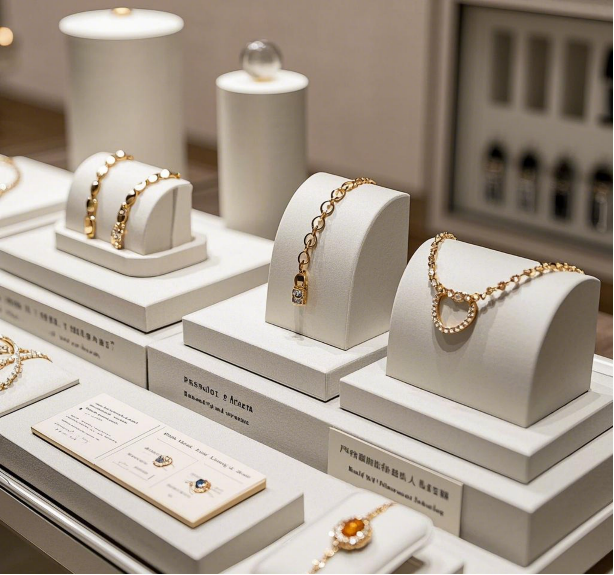
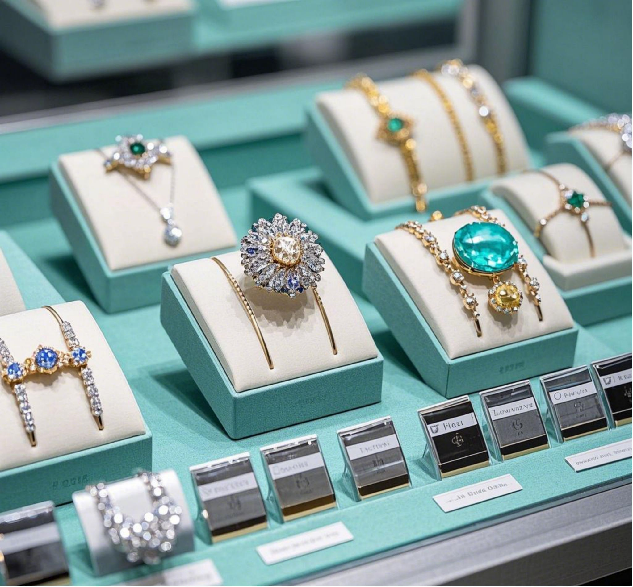
5. How to make jewelry display look more elegant? ——4 secrets of top buyer stores
Secret 1: Restrained color law
The whole space should not exceed 3 main colors. It is recommended to adopt the formula of “70% neutral color + 25% theme color + 5% contrast color”;
The robin egg blue wall of Tiffany store has an actual RGB value of (129,216,208).
Secret 2: Material mix and match philosophy
Use cold marble to set off warm rose gold;
Place the rough cement booth with the slender pearl necklace.
Secret 3: Dynamic light and shadow device
Install a programmable LED matrix on the top of the display cabinet to simulate the changes in light at dawn and dusk;
Let the light flow slowly on the surface of the jewelry to create the golden moment of “heartbeat 8 seconds”.
Secret 4: Olfactory binding memory
Release cedar aroma in the champagne gold exhibition area to strengthen the luxury association;
The pearl display area is matched with the sea salt sage scent to activate the image of the ocean.
Conclusion: Color is a silent salesman
From the purple curtains used by the Merchant of Venice to set off diamonds, to modern stores using algorithms to optimize RGB values, color has always been an invisible battlefield in the jewelry business war. Remember: the best color scheme is to make customers forget the existence of color, but let the jewelry leave an indelible memory in their minds.
Post time: Mar-25-2025
.png)
.png)
.png)
.png)

.png)