
When displaying jewelry, the background you choose can significantly impact how your pieces are perceived. The right background enhances the sparkle and beauty of your jewelry while also helping create an elegant atmosphere. In this blog, we’ll explore the best background colors, lighting, and styles to elevate your jewelry display to the next level.
1. What Is the Best Colour to Display Jewellery On?
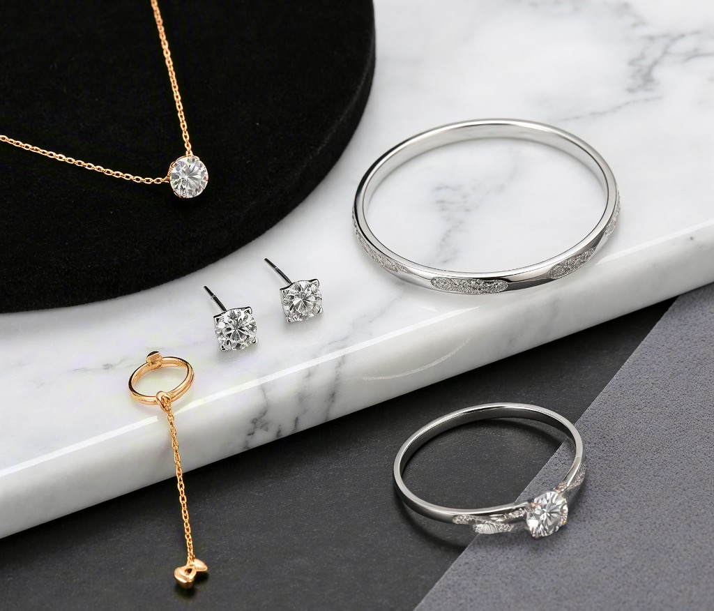
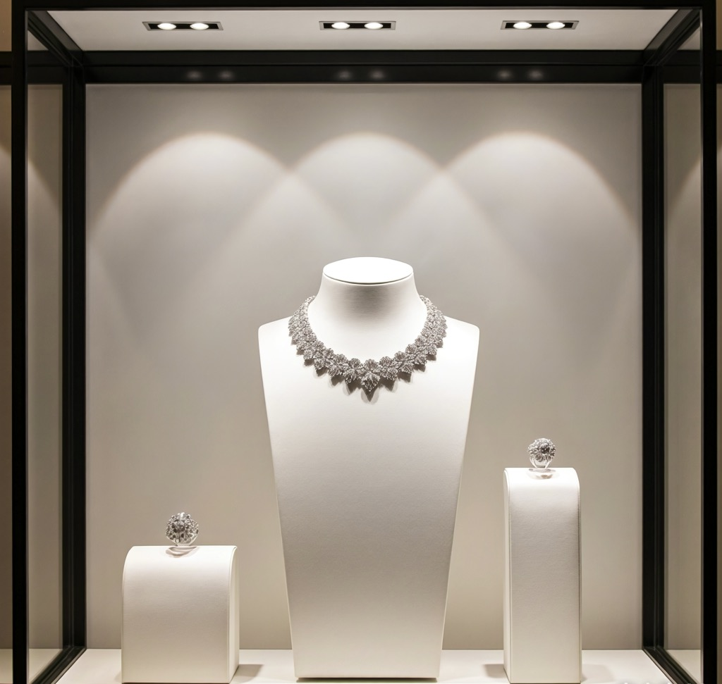
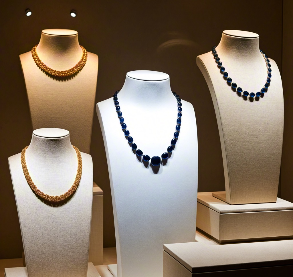
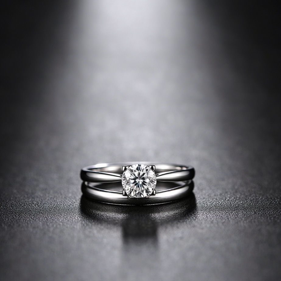
The color of the background plays a critical role in making your jewelry stand out. To showcase your jewelry at its best, the background should complement, not overpower, the pieces. Neutral colors such as white, black, and gray are universally effective and provide a clean backdrop that allows your jewelry to shine.
- White is a classic choice. It makes your jewelry appear vibrant and highlights the brilliance of diamonds, gemstones, and metals.
- Black creates a sleek, sophisticated look and offers great contrast for precious metals like gold and silver, making them pop.
- Gray is a more subtle choice, giving a soft, refined appearance without stealing attention from the jewelry itself.
If you’re displaying gold jewelry, a dark background like deep blue or charcoal gray can make the warm tones of gold stand out beautifully. Conversely, silver jewelry often looks best against black or white backgrounds.
2. Which Colour Looks Good in Background?
Beyond the jewelry itself, the background color influences the overall vibe of your display. Depending on the style of the jewelry and the setting, you may want to experiment with different tones.
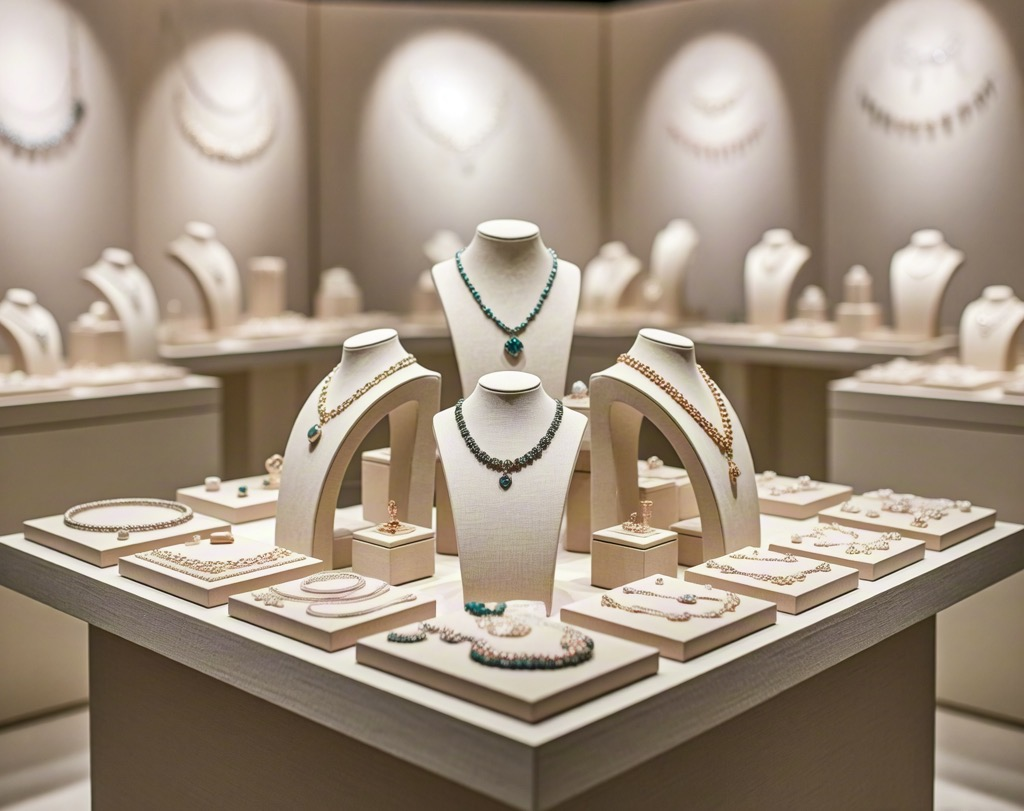
- Light pastel colors such as soft pink, lavender, or mint can create a delicate, feminine feel, which is ideal for vintage or delicate pieces.
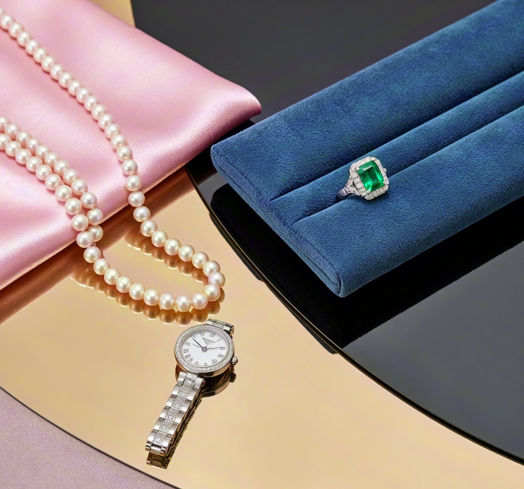
- Deep jewel tones, such as emerald green, ruby red, and sapphire blue, can complement high-end jewelry, bringing a sense of luxury to the display.
- Metallic shades like gold, bronze, or silver backgrounds can add a chic, polished look while emphasizing the luxurious nature of the jewelry.
When selecting a background, think about the style of jewelry you are selling. For instance, vintage jewelry often pairs beautifully with soft neutral tones, while modern minimalist jewelry may look better against bold, dark backgrounds.
3. What Colour Light Is Best for Jewelry Display?
Lighting is arguably just as important as the background when displaying jewelry. Proper lighting enhances the reflective qualities of gemstones and metals, helping your pieces sparkle. Here’s what to keep in mind when choosing the best light for your jewelry display:
- Warm White Light (2700K to 3500K): This type of light is the most flattering for jewelry, as it makes gold and diamonds appear more brilliant and warm. It also creates an inviting, cozy atmosphere that draws customers in.
- Cool White Light (4000K to 5000K): Cool white lighting tends to highlight clarity in diamonds and gemstones, making them appear brighter. However, this can sometimes make gold jewelry look dull, so it’s important to balance it.
- Natural Daylight (5000K to 6500K): Daylight is ideal for showing true colors. It’s best for showcasing colored gemstones like sapphires and emeralds because it allows the pieces to sparkle in their true light.
To achieve a balanced lighting effect, consider using LED lights, which provide a high level of brightness while keeping energy consumption low. Additionally, placing spotlights or under-cabinet lighting on jewelry pieces can help create dramatic effects.
4. How Do I Look Classy with Jewelry?
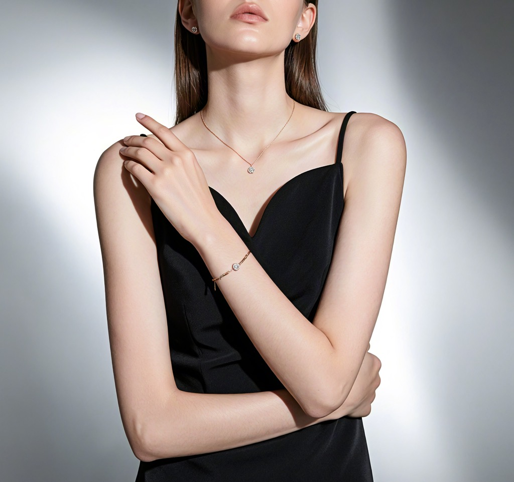
When aiming for a classy appearance in jewelry, a few styling tips can make all the difference. First, ensure the jewelry pieces are complementary to your outfit. Here are some tips on how to use jewelry to elevate your overall look:
- Simplicity is key: Classy jewelry should not overwhelm your outfit. Opt for elegant designs that add refinement without being too flashy.
- Mix metals with caution: While mixing metals can be stylish, it’s best to keep it to a minimum. For instance, pairing silver and gold or combining rose gold with yellow gold can create a balanced, luxurious look.
- Matching your jewelry to the occasion: For formal events, go for classic pieces like diamond studs or simple gold chains. For everyday wear, choose subtle, understated designs.
- Focus on quality: High-quality jewelry pieces made from fine materials like diamonds, gemstones, and precious metals naturally exude class.
Lastly, always remember that how you wear your jewelry matters just as much as the pieces themselves. Confidence and poise add an extra touch of class to any look.
5. What Are the Best Colors for Jewelry Stores?
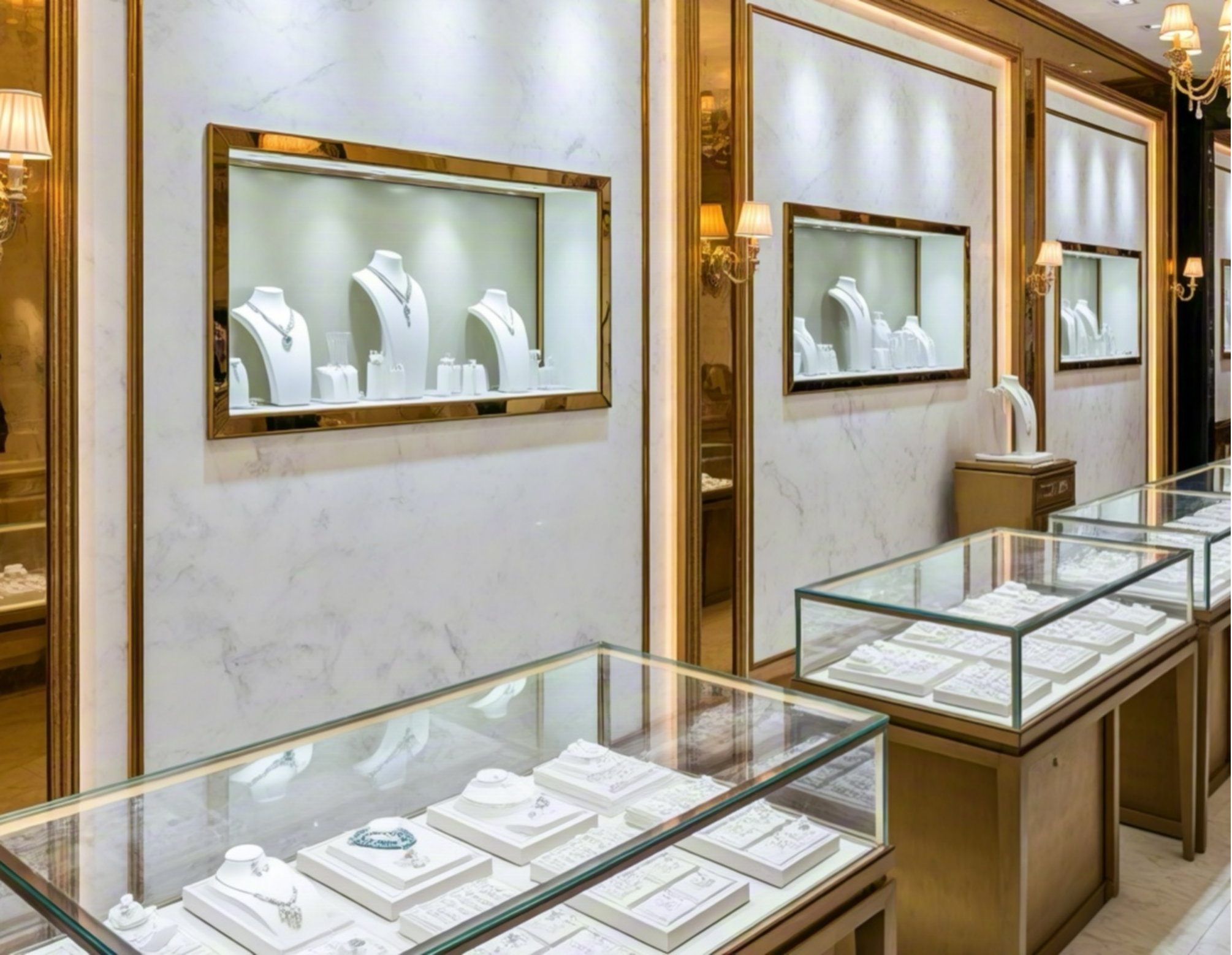
The color scheme of a jewelry store’s interior can significantly influence customer behavior and perception. The best colors should evoke a sense of trust, luxury, and sophistication.
- White and Black: These classic combinations never go out of style. White walls with black accents create a sleek, clean look, making it easier for customers to focus on the jewelry.
- Gold and Silver: Metallic colors are often associated with luxury, making them ideal for jewelry stores. These shades enhance the perception of value and high-end products.
- Soft Neutrals: Colors like beige, taupe, and soft gray can create a calm, welcoming atmosphere while providing a sophisticated backdrop that doesn’t steal attention from the products.
- Jewel Tones: Bold colors like emerald green, ruby red, or deep blue can work well in areas of the store where you want to create a dramatic effect. These colors highlight high-end, statement pieces.
In addition to choosing the right colors, consider the lighting and layout of the store. Strategic placement of products under well-placed lighting can enhance the visual appeal of the jewelry.
6. What Is the Best Background Colour for Selling?
When choosing a background color specifically for selling, the goal is to highlight the jewelry while creating an atmosphere that encourages a purchase. Research has shown that certain colors can influence buying behavior.
- White Backgrounds: This timeless choice works well because it offers a clean and crisp look, letting the jewelry stand out without distractions. White backgrounds create a feeling of simplicity and cleanliness.
- Black Backgrounds: Black provides an elegant, luxurious feel that works well for high-end jewelry. It enhances the shine and brilliance of gemstones and gives off a sophisticated vibe.
- Muted Tones: Soft grays, taupe, and beige backgrounds are great for creating a calm, welcoming space. These colors make customers feel at ease, increasing the likelihood of a purchase.
- Metallic Finishes: A background with metallic or pearlescent finishes can also work well for upscale displays, reflecting light onto the jewelry and making it appear more glamorous.
Conclusion:Ultimately, the best background color for selling is one that complements the jewelry’s design, appeals to your target market, and creates an inviting atmosphere conducive to shopping.
Choosing the right background for your jewelry display is crucial for creating a striking visual impact. Whether you’re setting up a display in a store, at a trade show, or online, the background color, lighting, and display method can make all the difference in presenting your jewelry in its best light. By considering the tips outlined above, you’ll be able to create an appealing, sophisticated backdrop that will catch the eyes of potential buyers.
Post time: Feb-17-2025
.png)
.png)
.png)
.png)

.png)